Outdated, fragmented tracking systems dominate large-scale shipping and manufacturing, leading to the annual loss or theft of 10% of vital equipment—trolleys, containers, roller cages. This results in costly supply chain disruptions and tens of millions in losses, highlighting the urgent need for real-time asset tracking.
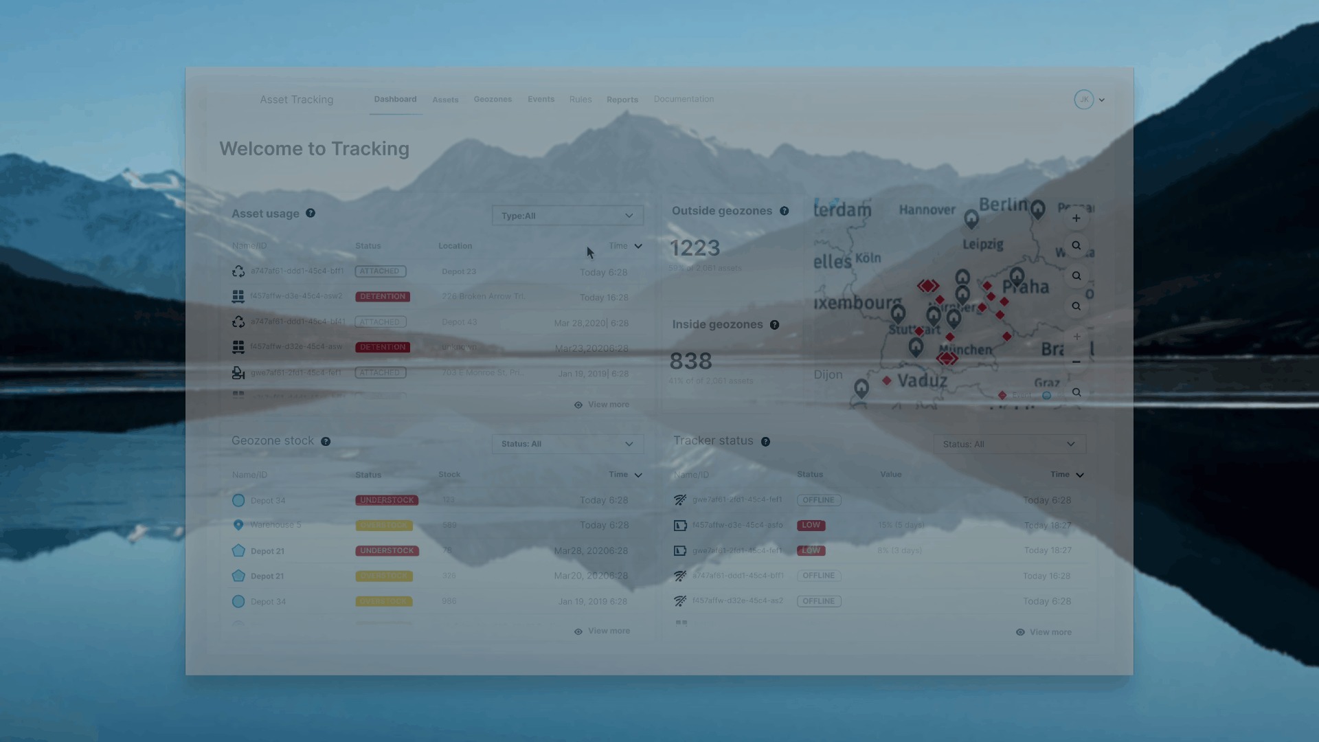
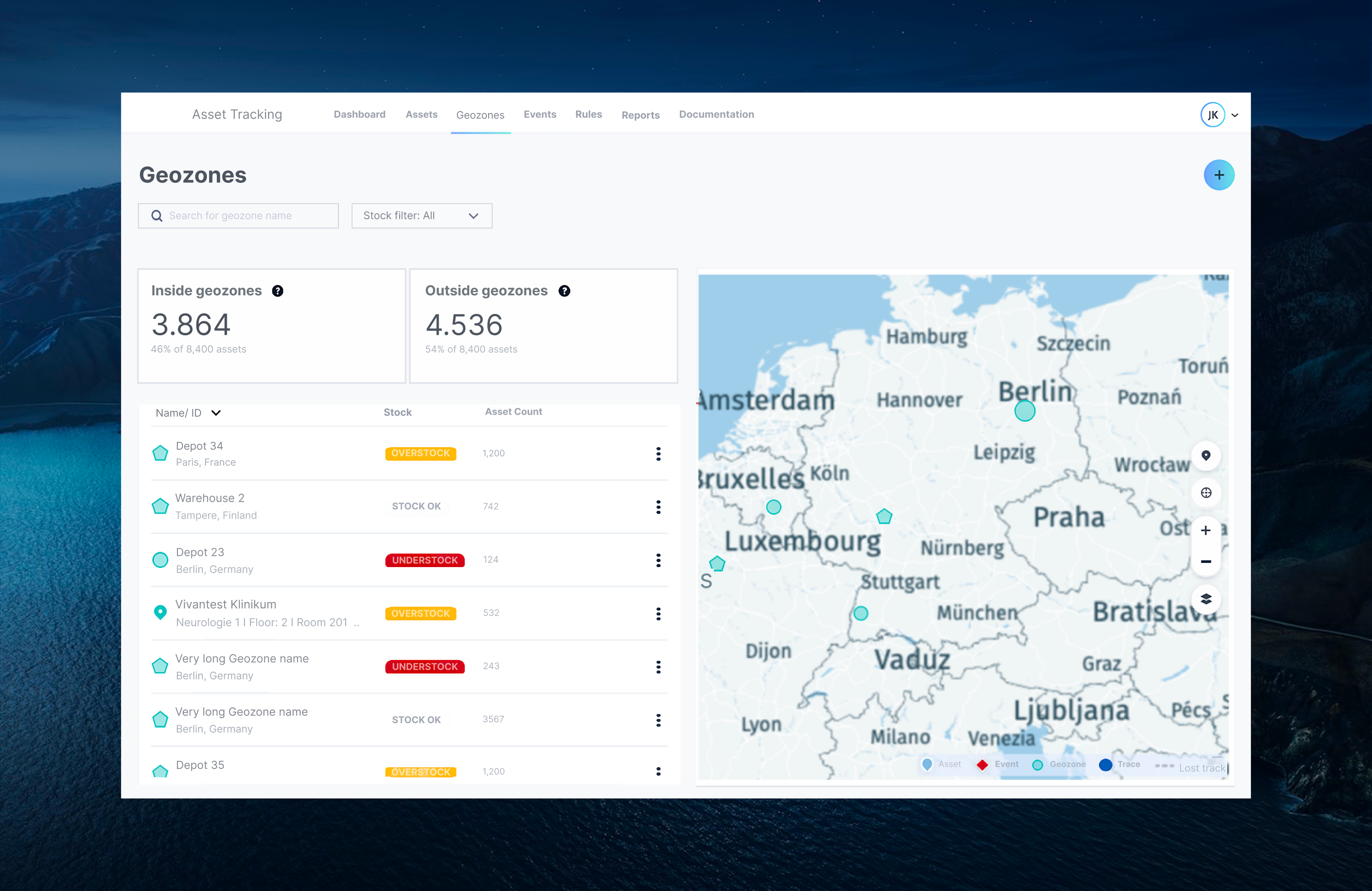
The IoT-enabled dashboard provides supply chain managers with real-time asset visibility, allowing swift identification of delays and exceptions. This data-driven tool helps optimise operations, coordinate deliveries, and dispatch technicians efficiently, reducing asset loss and costly disruptions.
My role [SIMPLIFY]
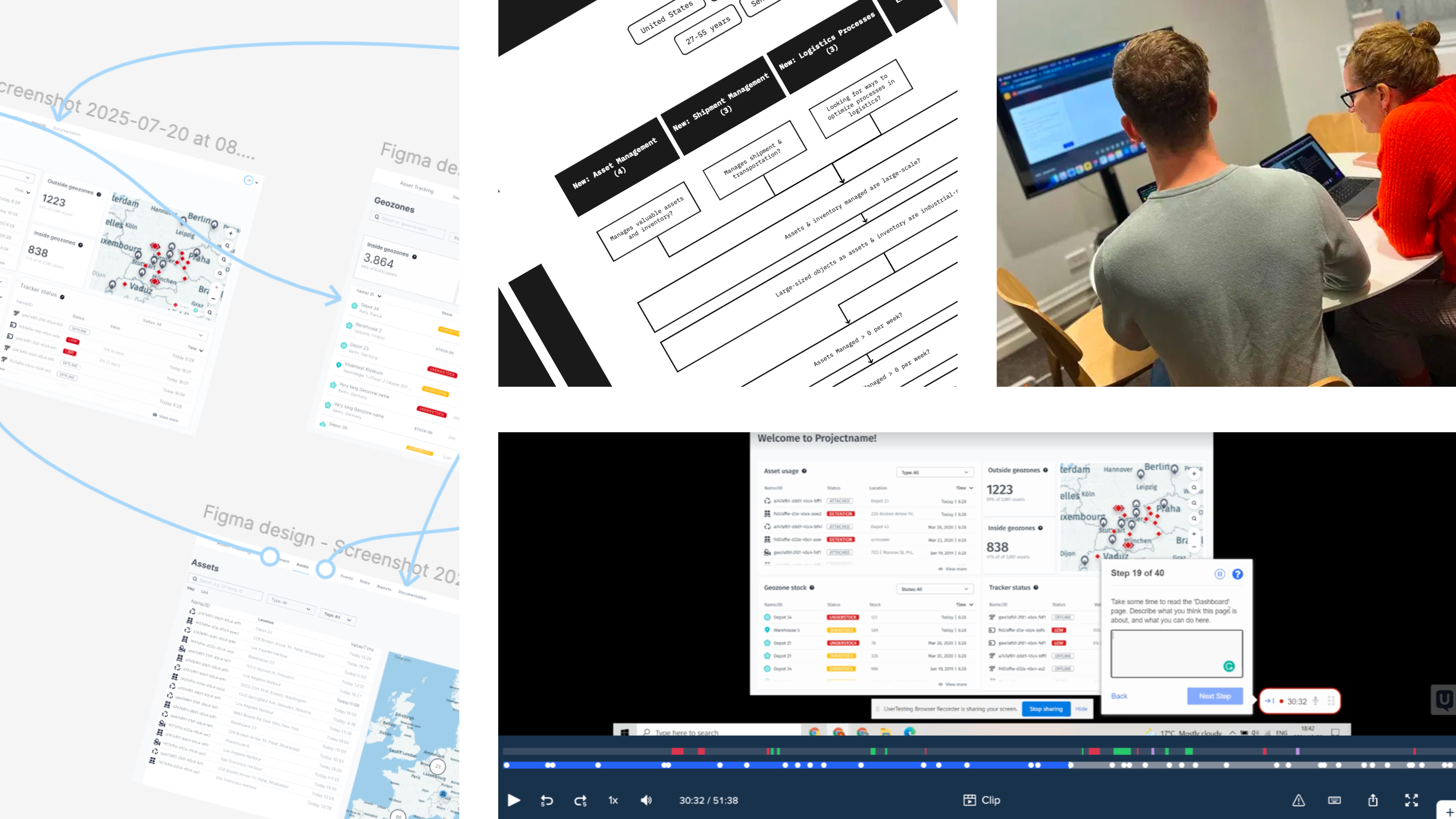
Contracted to lead the UX Design and spearhead the development of an interactive prototype, serving as a proof of concept to secure continued investment. In this highly collaborative, cross-functional role, working directly with the Directors of PM, Engineering I was responsible for the entire design process from inception to delivery. I actively facilitated agile workflows, ensuring transparency in design decisions and fostering open communication among stakeholders. My approach centred on embedding user-centric principles throughout product development, systematically incorporating user feedback to refine features and enhance usability at each iteration.
Enhanced dashboard alerts for better visibility and user attention alignment.
Introduced a reusable research framework, embedding continuous validation into development.
Team & Culture
Established agile, user-centered design practices with continuous feedback loops.
Fostered cross-functional understanding via open-source artefacts.
Strengthened user-centric decision-making, driving a data-informed team culture.
[COMBINE}
Journey
When I joined the team, the landscape was fraught with outdated workflows and a reliance on intuition over data-driven design. I was brought on board as a leader and contractor to guide an enterprise caught in the inertia of archaic waterfall methodologies. My mission was clear: to foster a user-centric approach, derisk development, and pivot the team towards agile, iterative design practices.
Onboarding and Discovery
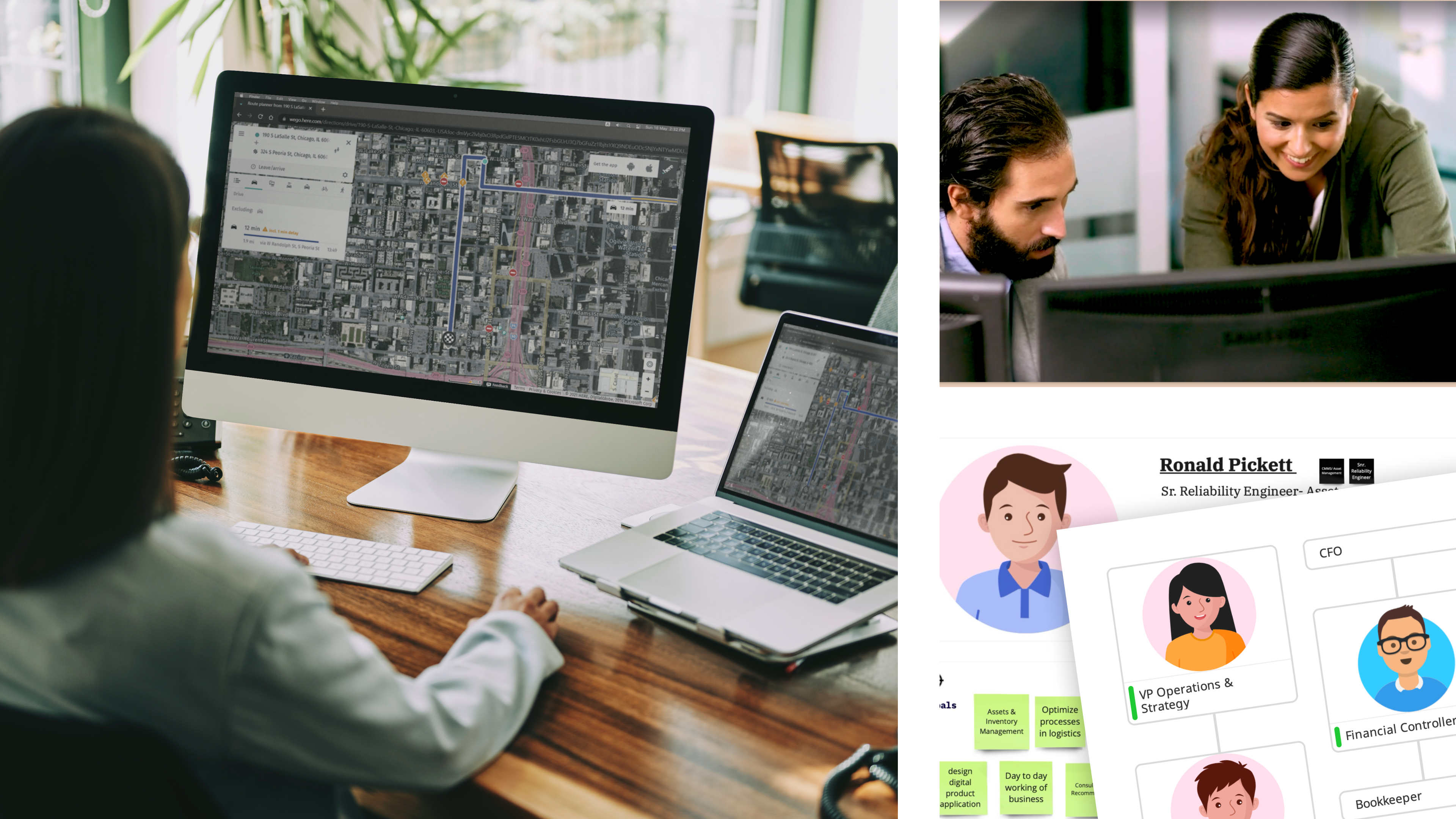
My rapid onboarding strategy leveraged existing knowledge while identifying the biggest risks early on. Understanding that the absence of a cohesive visual framework was a barrier, I initiated design sprints to align the team. The discovery phase was driven by intensive team interviews, which helped unearth pain points and opportunities within the existing process.
Understanding the Technology
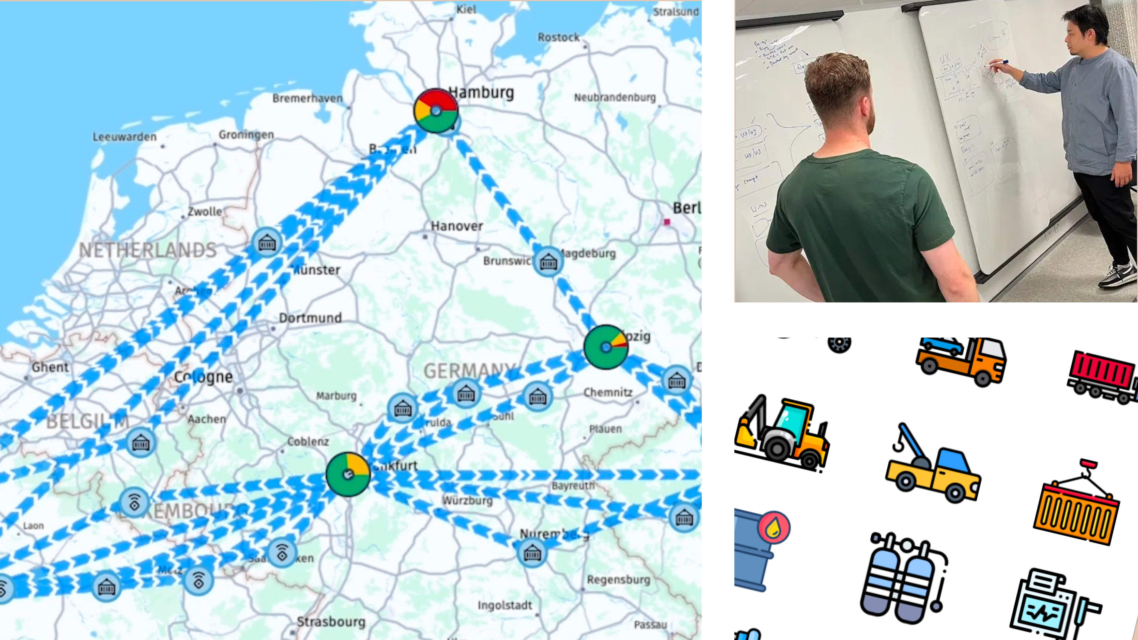
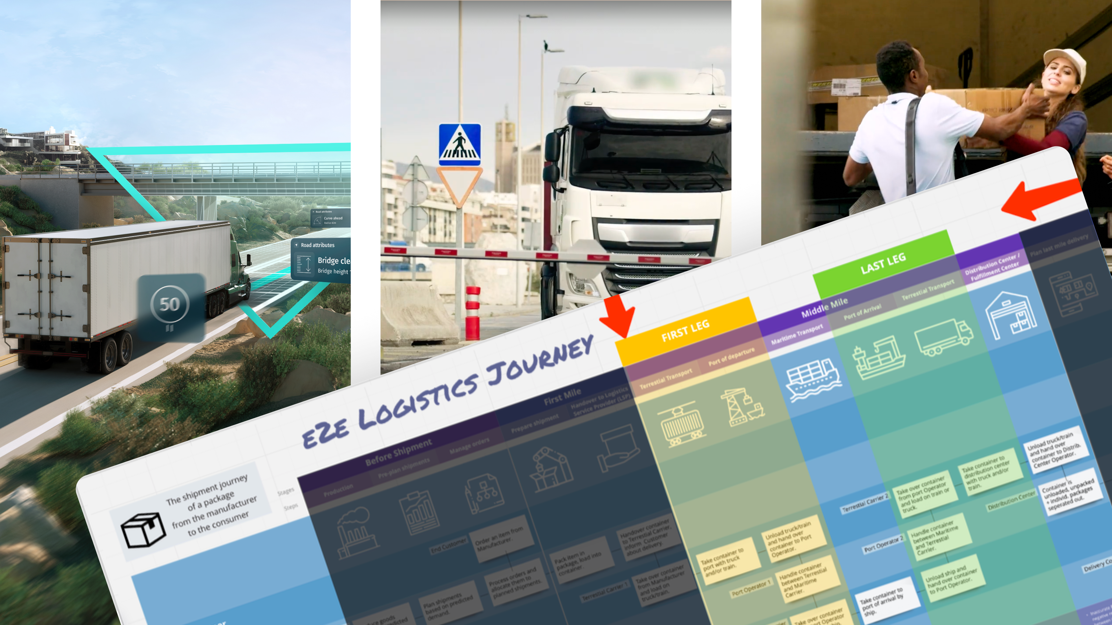
Immersing myself in the technical landscape, I explored the workings of IoT trackers. This deep dive was pivotal in grasping how these devices influence asset monitoring, providing real-time visibility across the logistics journey. The solution’s placement in the end-to-end logistics framework became clear, particularly its critical role in the middle-mile’s first and last legs—terrestrial transport linking depots and warehouses.
Mapping the Journey
Creating a detailed journey map, I illustrated where our solution fit within the broader logistics ecosystem. This visualization was instrumental in grounding stakeholders, clarifying how data flows from IoT trackers to dashboards, and highlighting the system’s impact on operational efficiency.
User Personas & Jobs to be done
Given the diverse stakeholders involved, from logistics centre operators to maritime transport and delivery firms, the solution’s core focus is on addressing the needs of supply chain managers. A Supply Chain Manager is responsible for keeping operations running smoothly, connecting suppliers, transporters, and teams to ensure goods flow efficiently. They track assets in real-time, quickly spotting delays or disruptions and adjusting schedules and resources to stay on course. Using real-time data, they make fast, informed decisions and proactively address risks to prevent issues before they arise.
Critical Tasks (Jobs to be Done):
Quickly verify at the start of each shift if any critical mobile assets are missing, detained, or off-course.
Proactively rebalance empty containers and cages between depots to prevent production bottlenecks.
Detect tracker performance issues early to avoid data blind spots, as data loss often equates to physical asset loss.
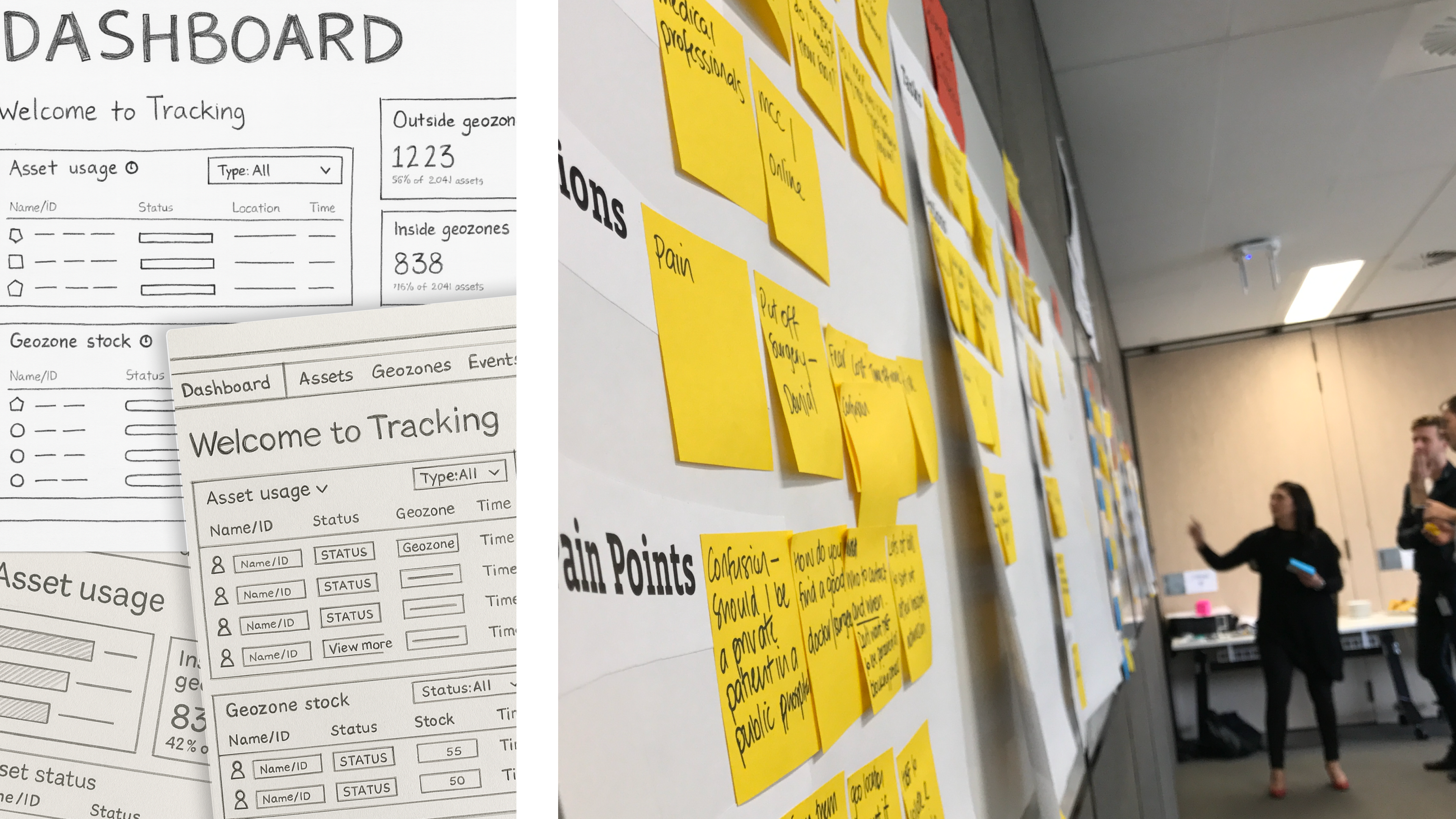
Wireframing
[sketches/voting]
Leveraging the team's knowledge of competitor solutions, we used group sketching to distill ideas, created a shared understanding and surface key assumptions to test like:
evaluated spatial vs. tabular dominated workflows
equal prominence between assets, geozones, and trackers panels
and exception flagging symbols & hierarchy
Incorporating HERE’s extensive asset library made realising sketches a breeze, and gave us the security that these tried and true design patterns would mean we would uncover deeper insights over superficial ones.
Delivery & Validation
We conducted unmoderated live Figma prototype testing on desktop Chrome browsers with three sets of 15 participants, focusing on top-level screens like Dashboard, Assets, Geozones, Events, Rules, and Reports. The evaluation centred on comparing our interface to existing tools, assessing its intuitiveness, mapping with users' mental models, and identifying standout features and usability perceptions. Key design findings highlighted the prominence of spatial views, a neuro-centric number system, and nuanced considerations for supply chain manager personas.
Reflections and Learnings
This journey reinforced that what you build is only as strong as the process you follow. Rapid onboarding, co-design, and securing buy-in were critical success factors. Research and user-centricity became team-wide responsibilities, transforming the culture from static workflows to one of continuous learning and agile innovation.
dashbaords & data deeply personal - affects test outcomes
—
Constraints
few/limited/no access to users
old-school, waterfall delivery model
bureacratic, traditional, heavy, risk-averse
——
3 sets of 15 person test
How does our interface compare to their existing tools & experiences?
How well does our interface (taxonomies, language) map to their existing mental model /workflows?
How intuitive/self explanatory is the dashboard interface?
What stands out the most; where is their focus drawn to, and what do they retain?
How useful, usable, or appealing do they deem this interface?
Unmoderated Live Figma Prototype Testing on Desktop Chrome Browser.
The test was comprised of nearly all written responses, with two final rating responses, covering the top-level screens from Dashboard, Assets, Geozones, Events, Rules, and Reports, gathering participant impr essions, expectations, understandings, discontinuities, and evaluations.
design findings
spatial view primary
euro-centric number system / language/content design
greater nuance to ‘supply chain manager’: orgsonas
400,000
elements: assets + iot trackers + geozones -
solution:
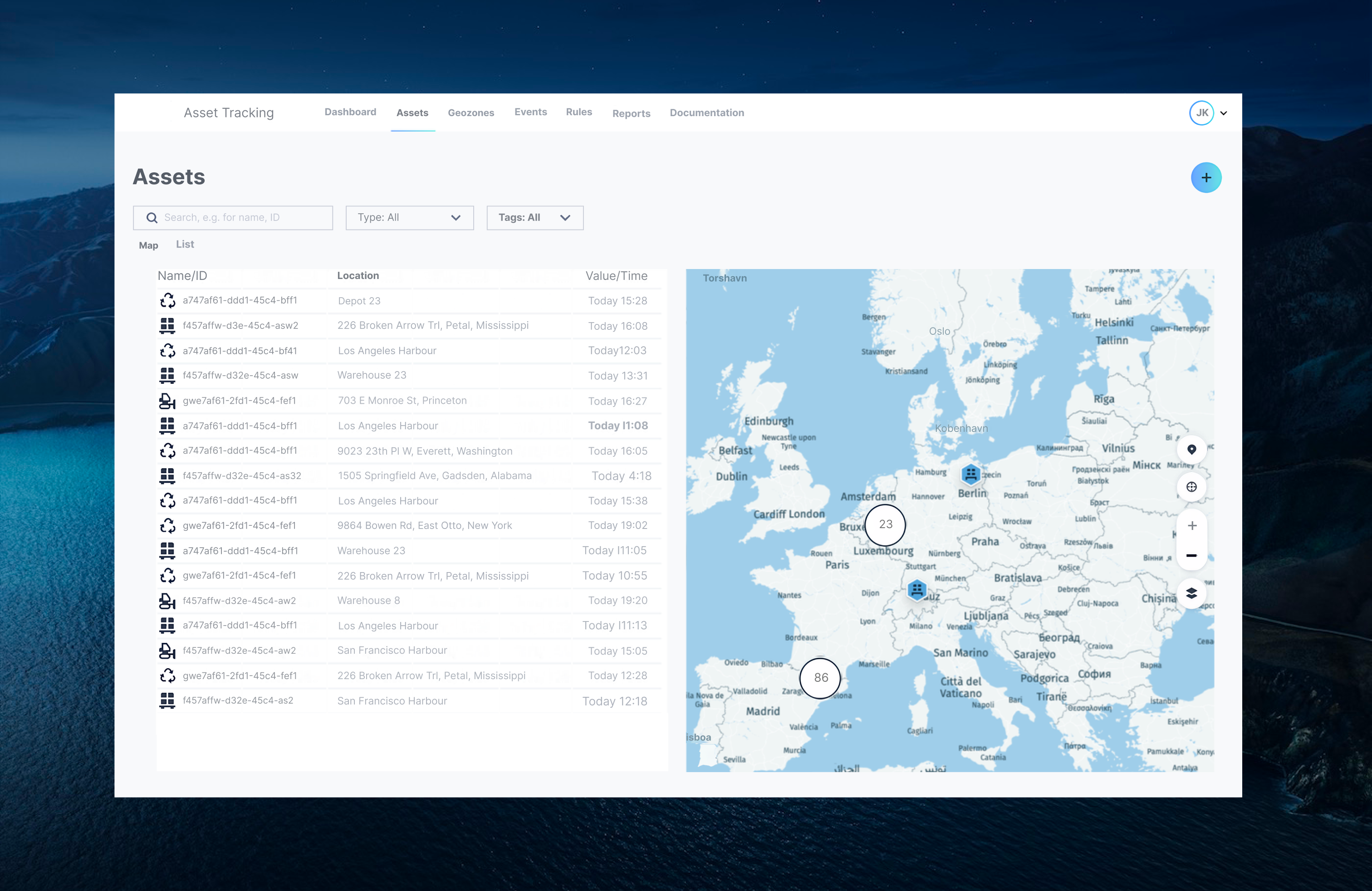
tabular & spacial -
asset usage vs geozone
Users reason differently about inventory balance by location vs individual asset events.
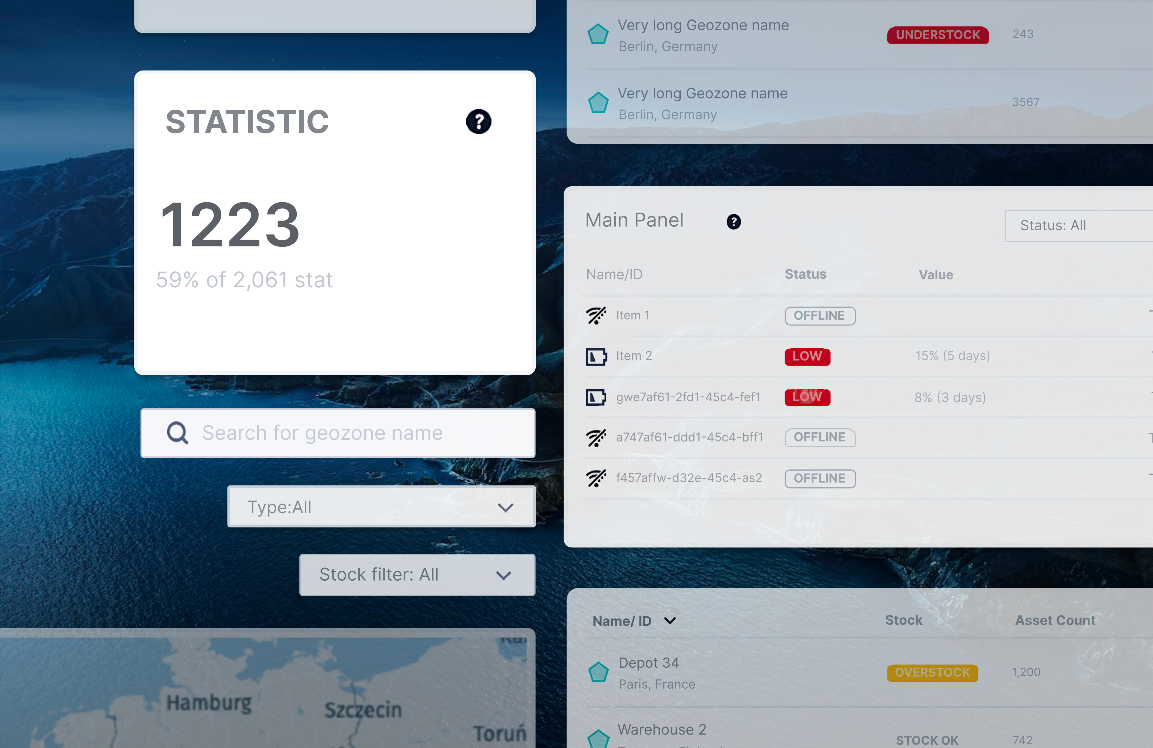
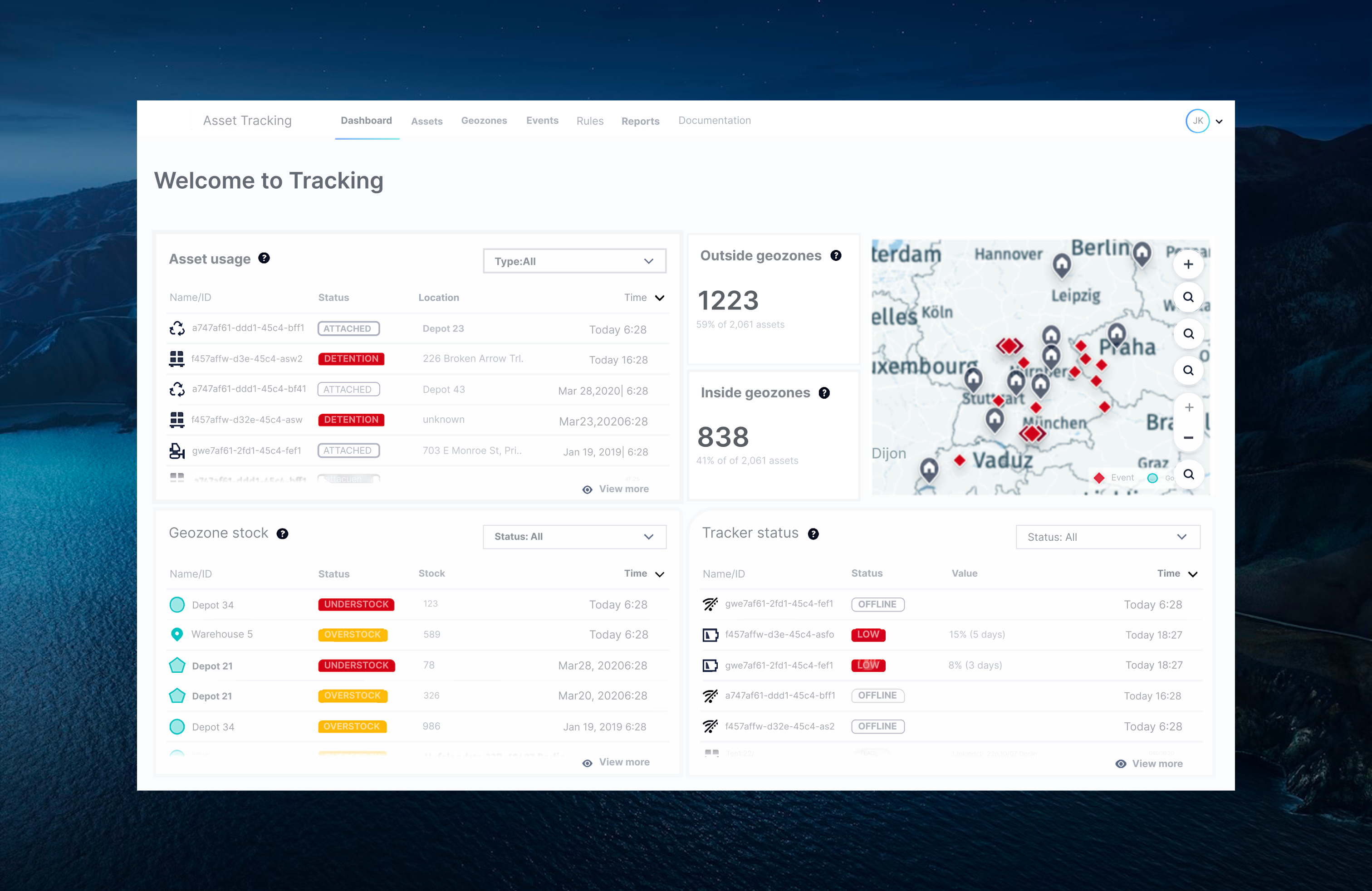
Stock counts + time: Helps judge whether an understock is stale data or a current shortage (e.g., “Today 6:28” vs “Mar28,2020” clarifies data trustworthiness).
load rebalancing to reduce emergency rentals or shipping delays—the “optimization” side of the solution pitch.
asset usage
Asset-level incidents (Detention, unexpected locations) are often the first sign of loss/theft; we surface a short, recency-sorted slice immediately on load; surface a short, recency-sorted slice immediately on load.
Status badge (ATTACHED vs DETENTION): Encodes whether the tracker is confirmed on an asset and whether it’s in an exception state—condensing complex telemetry into a simple operational state.
• Location + Timest
Outside / Inside Geozones KPI Tiles (top-center)
Immediate fleet health snapshot: The 59% / 41% split of 2,061 assets quantifies exposure risk at a glance; a spike in “Outside” triggers investigation before assets wander far enough to be lost.
Info (‘?’) tooltips: Reduces training burden in multi-site organizations; new staff can hover for definitions without leaving the dashboard.